
The 70s turned warm autumn tones up to the max with colours like Bonfire, Cinnamon and Paprika Sun. In this extract from a new book from Dulux, celebrating 90 years in the business, art historian, writer and curator Alexandra Loske, confirms that the decade is all about orange…
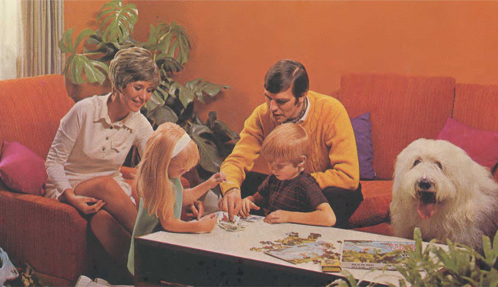
The 1970s was a time of Cold War and warm colours, and there’s no colour more intense and life-affirming than orange. It’s perhaps one of the most overlooked and misunderstood of colours in the spectrum, but it’s left its distinctive mark on fashion and art at various moments in history – most notably in the fabulously vibrant interiors of the 70s. In this decade, the first true post-war generation was decorating living spaces on a budget, but with a confidence and a desire for new styles as never before.
My first memories are of the mid-70s, when my parents opted for a bold new wallpaper with large orange and brown overlapping circles. As a child, I was fascinated by the abstract quality of these patterns. Were they stylised flowers? Were they circles of light emanating from the bulbous lampshades hovering overhead like UFOs? Circular designs in glossy orange were everywhere around us, reminding me of egg yolks glistening in a frying pan. and it wasn’t just the wallpaper. We ate from orange and brown pressed glass plates; we sat on squashy orange cushions, and my mother and aunts would often dress as if trying to compete with the wallpaper. Oranges, browns and yellows dominated not just the living spaces of trendy young couples in the 70s. I have fond memories of my grandmother’s orange and yellow melamine kitchen cabinets, which I decorated with flower stickers peeled from bottles of washing-up liquid. Growing up in West Germany, I was also surrounded by fat lava ceramics, which looked to me like, well, lava dropped from the sky in large, hot blobs. At such a young age, I couldn’t yet appreciate the brilliance of David Bowie, but I do remember thinking that he looked as if he were on fire when I saw the cover of Low (1977), his hair dyed bright orange, silhouetted against a tangerine background.
Orange is one of the most visible colours on the spectrum, and it’s used all around the world for this useful quality – we see it in street signage and on high-vis vests, for example, and for the boiler suits of construction site workers and prisoners. What needs to be seen and found is often coloured orange, such as the so-called ‘black boxes’ of aircraft. Yet, despite its visibility, orange is also strangely elusive. A compound or secondary colour, it occupies the chromatic space between the primary colours red and yellow and is often absorbed by one or the other.
No less luminous or visible than its neighbours, orange is strangely absent from early Western culture and consciousness. There was no basic colour name for it in the Western world for many centuries. In the English language, orange appears in Shakespeare’s time and even then only rarely, mostly as a modifier of brown. Before the 18th century, when it’s mentioned at all, orange is usually described as yellow-red or red-yellow. This is largely due to the history of the fruit that gives it its name: oranges were first cultivated in China thousands of years ago, but only made their way onto Western dining tables (and into the English language) much later. With the fruit came the name.
Isaac Newton was one of the first to put orange firmly on the colour map: his colour wheel, published in 1704, lists it as one of the seven prismatic colours. And German geologist Abraham Gottlob Werner’s delicious list of oranges (translated into English by the painter Patrick Syme in 1814) marked the first time a range of oranges were named and described in print: Dutch, Buff, Orpiment, Brownish, Reddish and Deep Reddish Orange. Earthy burnt ochres – another 70s favourite, tones of which come under the orange umbrella, were among the first colours ever used by humans, and can be found in the earliest cave paintings; but stable bright orange pigments and dyestuffs are rare in Western culture. Brilliant orange only became widely available in the form of ‘modern’ or synthetic pigments, such as chrome and cadmium oranges, in the 19th century.
The experimental Impressionists and Post-Impressionists loved these new, glowing colours, and painted many a cadmium-orange sunset. The Pre-Raphaelites and their followers then dressed female figures in swathes of orange fabric (the best example being Frederic Leighton’s Flaming June painted in 1895) and their high Victorian art influenced 1970s fashion designers, such as Zandra Rhodes, Bill Gibb and Ossie Clark, who created maxi dresses with screen-printed floral patterns, often in similar jewel-like colours. I’ve always felt that this sunny palette is diluted by adding dark and earthy browns to it, especially in interior decoration. But in the 70s, these autumnal colour combinations became incredibly popular, inspired – no doubt – by the nature-loving hippy movement and its emphasis on natural colours and textures.
Many of these bold colour schemes had disappeared by the end of the decade and given way to palate-cleansing whites and creams but, as a student in the early 90s, I unexpectedly found myself briefly living with the palette of my childhood again. After the fall of the Berlin Wall, I moved to the former East Germany and rented apartments that had not yet been redecorated. The two prevailing colours of walls, tiles, kitchen cabinets and woodwork in those beautiful, run-down Berlin buildings? Orange and brown.
Want to find out about some other decades? Buy the book here.
DULUX IN THE 70s – GLOSS AND GLITZ
Think Poppy, Limejuice, Sultan… in gloss so shiny you needed shades. These were the brave new Dulux colours in a finish that captured the 70s vibe perfectly
The bold approach to colour that defined the 60s rocked on into the next decade, but picked up a richer, warmer feel on the way. By the mid 70s, many homes had a colour TV set, complete with a chroma dial that allowed you to turn the colour up to the max for super-saturated lime-green grass and amethyst skies. Programmes like The Six Million Dollar Man and The Avengers demanded attention with their bright sets and costumes – a welcome and cheering distraction from the British weather and the challenging economic and political landscape of the time.
Natural materials like wicker and cork also featured heavily in 70s homes, influenced by a rising awareness of environmental issues and a growing interest in back-to-nature lifestyles, encouraged by hit Brit TV show The Good Life. No high street was complete without a wholefoods outlet, with brewing and bread making the most popular weekend hobbies next to decorating. Homeowners embraced rich natural shades like Cinnamon, Bamboo, Linden and the legendary avocado – all featured in the Dulux 1975 New Generation colour card.
This was also the decade when paint got a lot more practical, as Dulux explored smart and original ways to make its products work harder, especially for families. The new wipe-clean technology in Dulux Vinyl Silk meant splashes and stains could be wiped away easily without damaging the paint finish, so it looked as good as new for far longer. Pioneering stain- blocking technology in Dulux primers made it easy, for the first time, to paint walls and ceil-ings stained by the soot from open fires… and all that nicotine. And then there was non-drip gloss. No decade embraced a gloss finish like the 70s but, up until now, it had been a tricky paint for the DIYer to work with – until 1973 that is, when Dulux launched its Super 3 non-drip gloss with Silthane. The rich, easier-to-apply formula had a tough, long-lasting finish – and, even better, no drips – making it an instant success, with more than one million litres sold within a month of its launch.