Colour is important. But it’s really important when you are choosing a colour scheme for school pupils that have special needs.
Paint expert Dulux Trade has supported the design of two new multi-sensory classrooms at Firwood High School, Woodbridge Academy in Bolton. To ensure a comfortable and inclusive learning environment for pupils with special educational needs and disabilities, Dulux Trade drew upon its colour expertise to create bespoke palettes that instil feelings of calm and aid productivity.
Firwood High School, Woodbridge Academy in Bolton is a severe learning disabilities (SLD) school for children aged 11-19 and its core focus is on providing young people with varying needs the chance to learn in a welcoming and supportive environment. Having worked with Firwood High School for several years, the team at Dulux Trade recognised an opportunity to create colour palettes for two multi-sensory classrooms (that are designed to help engage students using more than one sense at a time) that the school can use to further support its students.
Dawn Evans, Head of School at Firwood High School explained: “For multi-sensory classrooms to work effectively, it is important to create a calming and relaxing space that eliminates distraction and can be easily adapted to suit the needs of every pupil. Thanks to the Dulux Trade team’s expertise and extensive research into our school and the needs of our students, they have been able to create beautiful colour palettes that enhance the learning experience for our pupils and allow us to educate in a supportive environment.”
To make the multi-sensory classrooms a comfortable environment for all, it was important to avoid colours used in traditional classroom settings such as brilliant whites and bold reds, yellows and oranges as they can be overwhelming and distracting. Instead, the Dulux Trade team looked to softer tones to create a tranquil and calming space.
Jayne Roughan, National Sector Manager Retail & Education at Dulux Trade said: “Colour is crucial to the successful design of learning environments – and this is especially true for students with special educational needs and disabilities. Our team of expert colour consultants understand that colour and design can impact on how occupants feel and behave within a space, which is why they work closely with clients to understand the purpose of the environment and identify palettes that can support this.
“When Dawn Scott, Commercial Colour Consultant at Dulux Trade designed the colour schemes for Firwood High School’s KS3 and PMLD multi-sensory classrooms, she used a palette of softer tones that instil feelings of calm and relaxation – and act as a neutral backdrop for a wide range of activities – such as warm neutrals, pinks, deep blues, and greens.”
Choosing the colours
As well as the choice of colour, it was also important for the Dulux Trade team to consider how different tones could be used to enhance wellbeing. For example, critical surfaces (walls, floors and doors) were all painted in contrasting colours to aid wayfinding and promote familiarity and independence. Using gentle tones like 30YY 78/018, 10RR 53/087 or 30GY 62/159 for the walls and bolder shades like Midnight around door and window frames can make these elements stand out and help students to navigate around the space more easily. In addition, using a stronger hue like 10RR 21/235 and 90GG 39/220 for the teaching wall helps to draw the eye and boost pupils’ focus.
The Dulux Trade team also had to carefully consider how natural light could affect the colours chosen. Using cooler tones in southerly sunny rooms and warmer shades in northerly, shadier, rooms can help make the space feel more comfortable – and mid and deeper tones help to absorb sensitive glare in bright areas. With both classrooms facing northwest, Dulux Trade selected warm pinks and violets in the KS3 classroom to create a harmonious scheme – and calm greens and blues in the PMLD (profound and multiple learning difficulties) classroom to bring light and balance.
Dulux Trade also wanted to ensure a long-lasting, easy to maintain finish that could withstand the high foot traffic of the school environment. As such, the Dulux Trade Scuffshield range was recommended, as it has been designed to protect walls against scuff marks from items like shoes and bags – and it is cleanable.
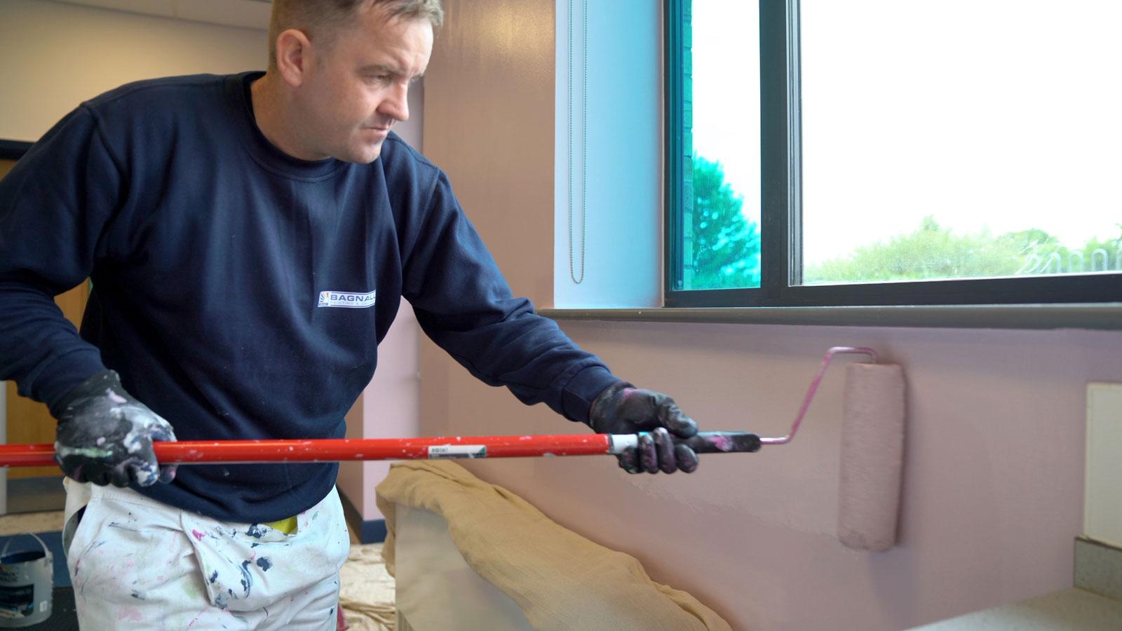
To help deliver the project on time and to a high standard, the Dulux Trade team worked closely with contractor and Dulux Connect Partner Bagnalls Painting Contractors. “Here at Bagnalls, we embraced the opportunity to get involved”, said Steve Bethell, Contractor at Bagnalls Painting Contractors. He continued: “We have been working with Dulux Trade since 1920 and trust in the quality, durability, and easy application of its products. Scuffshield was quick and easy to apply and thanks to its water-based formula, the paint dried in just four to six hours – enabling us to adhere to tight timescales and deliver the project in time for the students’ return in September.”
Dawn Evans continued: “As well as being the right colour, it was also important for the paint to be highly durable and offer sustainability benefits. With Scuffshield, we can trust that the finish the team apply will last over time and reduce the need for re-application. The low VOC levels is also a huge benefit as it reduces impact on the environment – and ensures the health and safety of our students.
“We are absolutely thrilled with the design of the two multi-sensory classrooms and are looking into how we can utilise the Dulux Trade colour palettes created for this project across other areas of the school.”
To find out more about this project watch the video:
To find out more about Dulux Trade and its products click here

